“The most effective alert to the threat of climate change is likely to come from the world of art rather than of science, because art has such an extraordinary way of cutting across human society.” – Thomas Lovejoy, Conservation Biologist
Excerpt:
A new study found that using art to convey environmental data eased political perceptions about climate change. As wildfires rage in Canada and New York City recovers from a week of smoke, the study’s findings could help scientists more effectively communicate their research at a pivotal point in the future of the planet.
Nan Li, Isabel I. Villanueva, Thomas Jilk, and Dominique Brossard of the University of Wisconsin and Brianna Rae Van Matre of the nonprofit EcoAgriculture Partners conducted the research, published May 31 in the journal Communications Earth & Environment. Li conceptualized the project two years ago when she heard artist Diane Burko speak during a webinar; the artist, whose practice centers on climate change, was pondering the real-world impact of her work.
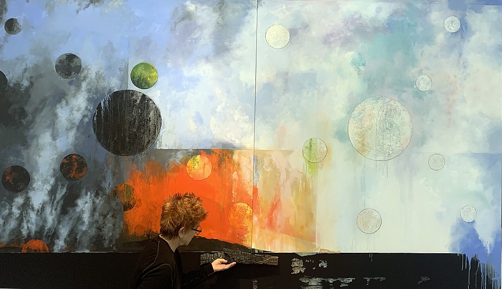
Burko depicts the consequences of Earth’s warming atmosphere, such as melting glaciers and disappearing coral reefs, and often accompanies them with scientific maps and charts. Li and her colleague Dominique Brossard developed a study to answer Burko’s question — how does the artist’s work affect its viewers? The team chose Burko’s 2020 mixed-media work “SUMMER HEAT, I and II.” The graph at the lower left depicts the Keeling Curve, a visualization of the amount of carbon dioxide in the atmosphere since 1958. The blue represents melting glaciers, and the red figure is Europe, which suffered an intense heat wave in 2020 when Burko created the work.
In Li’s study, which surveyed a total of 671 people, participants were asked to look at both the Keeling Curve on its own and Burko’s artwork. The scientists also showed the viewers the works as Instagram posts. In one striking finding, the researchers discovered that participants perceived Burko’s artwork to be just as credible as the standalone graph. People also felt more positive emotions when they saw “SUMMER HEAT, I and II” than when they saw the Keeling Curve alone…
Article referenced:
“Artistic representations of data can help bridge the US political divide over climate change.”
Communications, Art and Environment (05-31-2023))
Abstract
Visual art has been used to revamp the portrayal of climate change with the aims of engaging emotions and expanding nonexperts’ psychological capacity to perceive its relevance. However, empirical evidence supporting the effectiveness of artistic representation of data as a tool for public communication is lacking. Using controlled experiments with two national samples of U.S. adults (total N = 671), here we found that artistic visualizations elicited stronger positive emotions than informationally equivalent data graphs but did not differ in their perceived credibility or effectiveness as visual aids for learning. When used to prompt individual reflection, artistic visualizations appeared to mitigate the political division in viewers’ perceived relevance of climate change that could otherwise be exacerbated by exposure to data graphs.
Diane Burko’s “Seeing Climate Change” | American University Museum (10-27-2021)
An introduction to “Diane Burko: Seeing Climate Change,” on view through December 12, 2021.


